Contrast
Text contrast
Depending on the size, text have to pass different contrast ratio in order to achieve maximum readability. Text that is part of a logo or brand name or is a part of an inactive UI component has no contrast requirement.
Normal Text (24 px or 19 px bold text)
AA – 4.5:1 contrast ratio
AAA – 7:1 contrast ratio
Large text (≥24 px or ≥19 px bold text)
AA – 3:1 contrast ratio
AAA – 4.5:1 contrast ratio
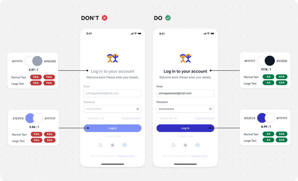
Guidelines in WCAG
Non-text contrast
For every actionable or critical element, you need to make sure there is enough contrast for it to be easily distinguishable. This includes buttons with hover and disabled state.
Element Size:
≤16 px – 4.5:1 contrast ratio
≥16 px – 3:1 contrast ratio
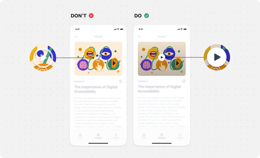
Guidelines in WCAG
Content Design
Use simple language
Write content that is easy to read so that people can find what they need, understand it, and use it without feeling too overwhelmed. By using simple sentence formulation, content is understood faster and more easily.
Do:
use simple sentences and communicate in a conversational tone, friendly and polite;
if using slang, jargon, metaphors and idioms, provide explanation or translation (like a glossary).
Provide:
- easy access to real meaning of abbreviations or acronyms.
Don’t:
confuse users with too much information and complex words or descriptions.
Guidelines in WCAG
Useful Tools
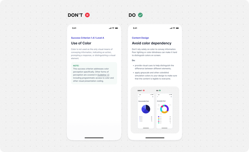
Avoid color dependency
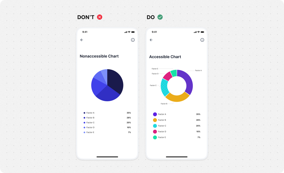
Don’t rely solely on color to convey information. Poor lighting or color-blindness can make it hard to distinguish colors on screen.
Do:
provide visual cues to help distinguish the difference between different elements;
apply greyscale and other colorblind simulation colors to your design to make sure that the content is legible to everyone.
Guidelines in WCAG
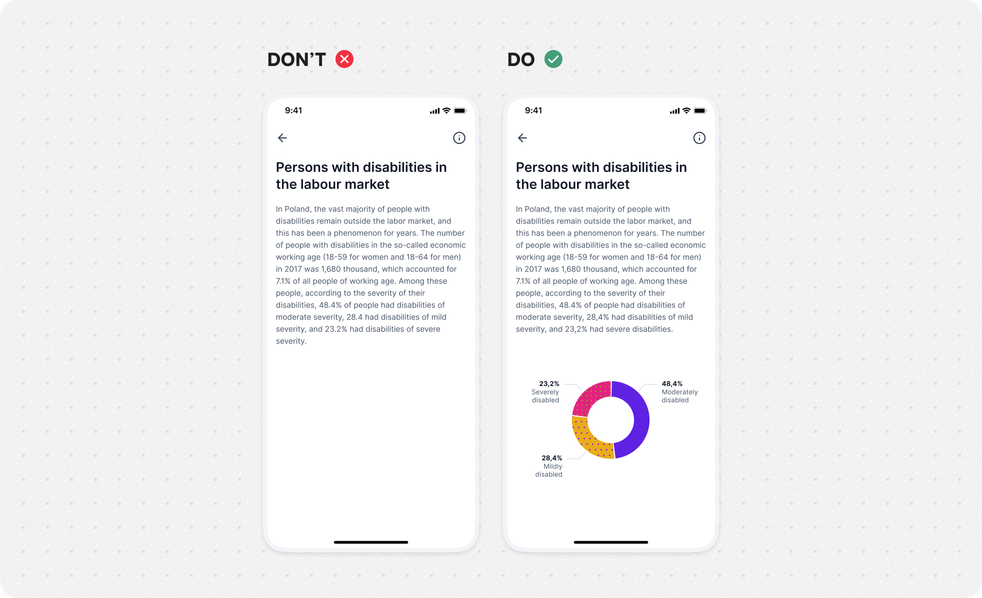
Use visual support for complex information
Use images, colors and shapes as a support to visually help users digest complex graphs or blocks of information. But do not rely solely on it.
Provide:
visual supporters to make it easier for users to understand information when you are presenting facts, statistics or any large group of data;
any kind of visual system that clearly shows the correlation between the observed information.
Guidelines in WCAG
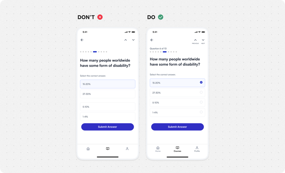
Don’t rely solely on sensory characteristics
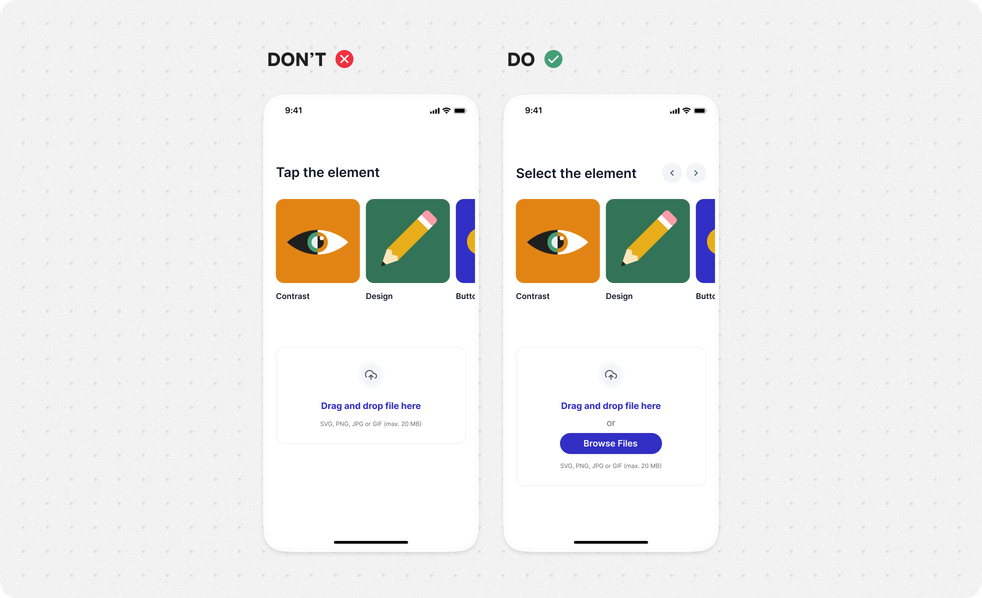
Any type of instruction or direction should not depend on a specific format, spatial location, sound, or any other sensory characteristic.
Provide:
- clear instructions or labels that provide meaning to users.
Guidelines in WCAG
Text spacing
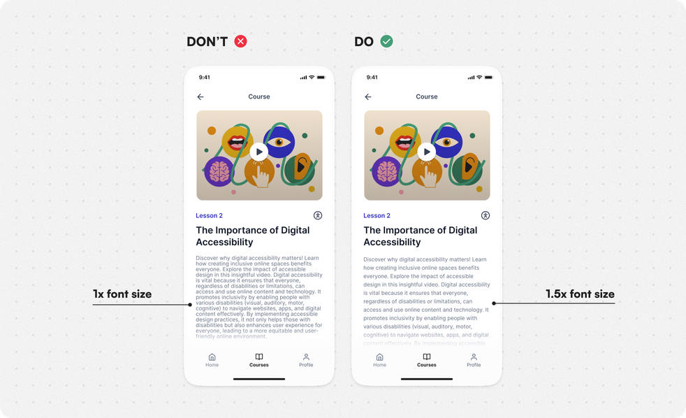
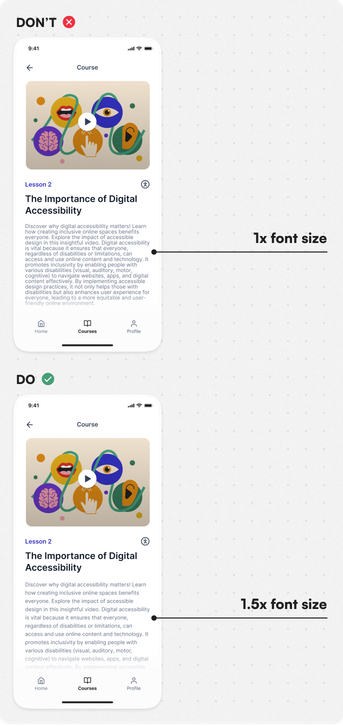
When people change the size of text on their own, the information should still be easy to read and understand.
Keep the following fixed:
- line height (line spacing) - min. 1.5x the font size;
- spacing following paragraphs - min. 2x the font size;
- letter spacing (tracking) - min. 0.12x the font size;
- word spacing - min. 0.16x the font size;
text is not justified (aligned to both the left and the right margins).
Guidelines in WCAG
Graphic Elements & Media
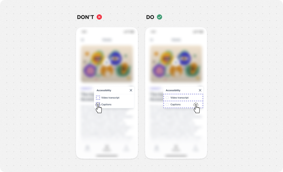
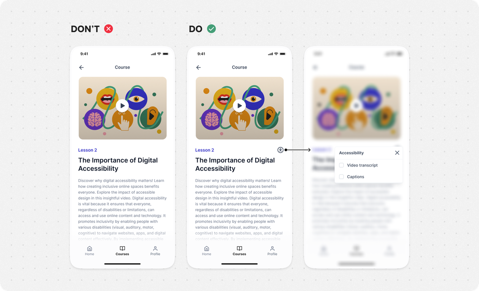
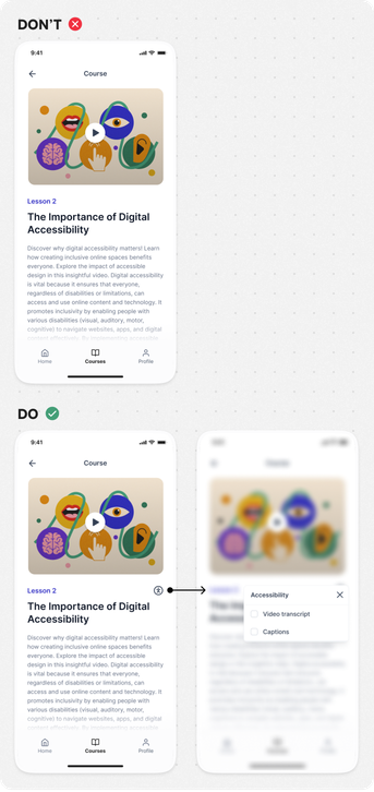
Include audio & video captions and transcripts
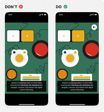
If you have audio or video content, you need to provide access to transcripts or captions. This helps people with hearing or vision problems to understand the content.
Audio-only:
- provide descriptive text transcription - must have (A);
- provide captions - must have (A/AA);
provide descriptive text transcription (live content) - nice to have (AAA).
Video-only:
provide descriptive text transcription and/or an audio description strip that can be enabled - must have (A/AAA).
Synchronized:
- always provide captions - must have (A/AA);
provide extended audio description for all video - nice to have (AAA);
- provide descriptive text transcription - nice to have (AAA);
- provide sign language translation - nice to have (AAA).
Guidelines in WCAG
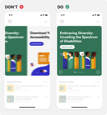
Reduce blinking and flashing elements
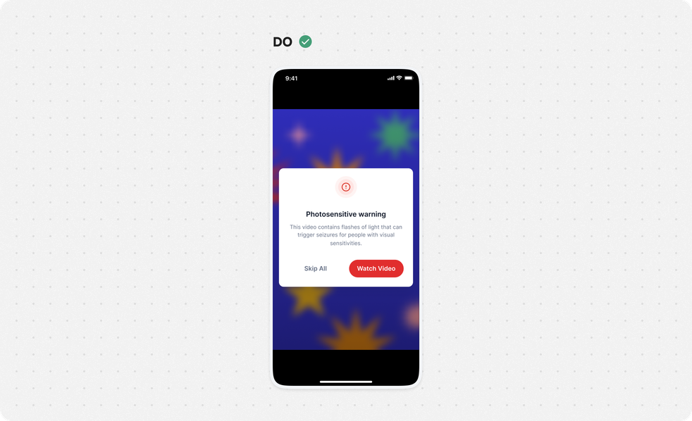
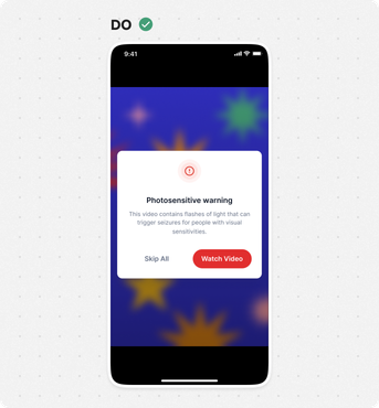
Don’t use flashing elements that could cause seizures or physical reactions. Try to use still images instead of moving or blinking ones. If you do use moving or blinking content, make sure there’s a way to stop or pause it.
If you do use flashing elements:
- If you do use flashing elements:
- warn users in advance about photo-sensitive content;
flash rate can be higher than 3/s if flashes are in low contrast/have little red - must have (AA);
- flash rate is always below 3/s - nice to have (AAA).
Guidelines in WCAG
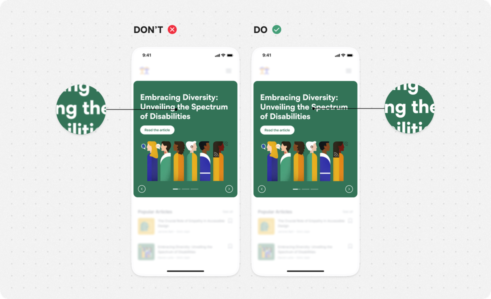
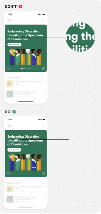
Don’t put important information inside an image
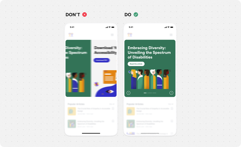
Images can stretch, have poor color contrast, or become blurry, making it hard for users to see the information.
Do:
- create images without embedded text for developers;
- put all the text outside of the images.
Align with developer:
- prepare images as separate assets for developers. All text needs to be implemented independently of images.
Guidelines in WCAG
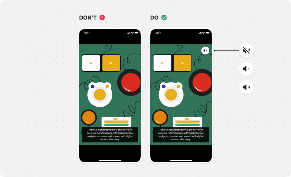
Separate speech from background sound
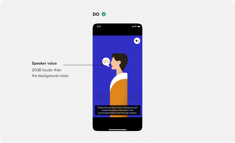
Make sure non-speech sounds are quiet enough for people with hearing difficulties to distinguish speech from background noise.
Do:
mix audio files so that non-speech sounds are at least 20 decibels lower than the speech audio content;
- allow users to turn off the background sounds.
Guidelines in WCAG
Useful Tools
Content Structure
Adapt UI to changing font sizes
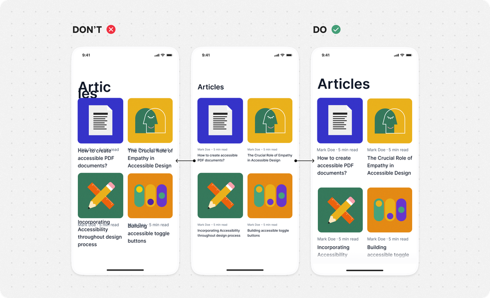
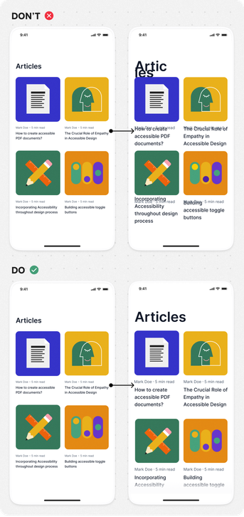
Users can change the font size on their device or browser. Test your design to make sure it works well with both the largest and smallest font sizes.
Ensure that:
- text can be scaled up to 200% successfully, without disruption in the way information is presented, while still maintaining readability and legibility;
- UI elements are still usable once users increase their font sizes.
Align with developer and QA tester:
- check how the implemented design scales if you increase the font size;
- cover the component adaptations in your design.
Guidelines in WCAG
Useful Tools
Include a page title
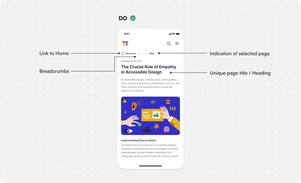
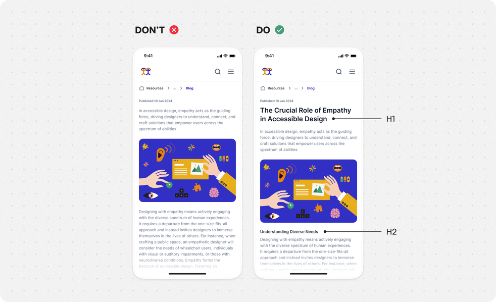
Don’t remove titles and headers from a screen/page you are designing. By doing so you make it harder for users to scan and analyze the context and purpose of the page. It takes longer to connect meanings behind and involves more of user’s effort. For users who use assistive technologies it may become even harder to understand.
Provide:
- clear headings to make the content more readable, understandable and easier for users to scan through;
- title that describes topic or purpose of the website.
Align with developer:
- each page and screen has a unique title that accurately represents its content;
- webpage title length is between 50-75 characters;
- title of the page is the heading level H1 on the page.
Guidelines in WCAG
Language selection
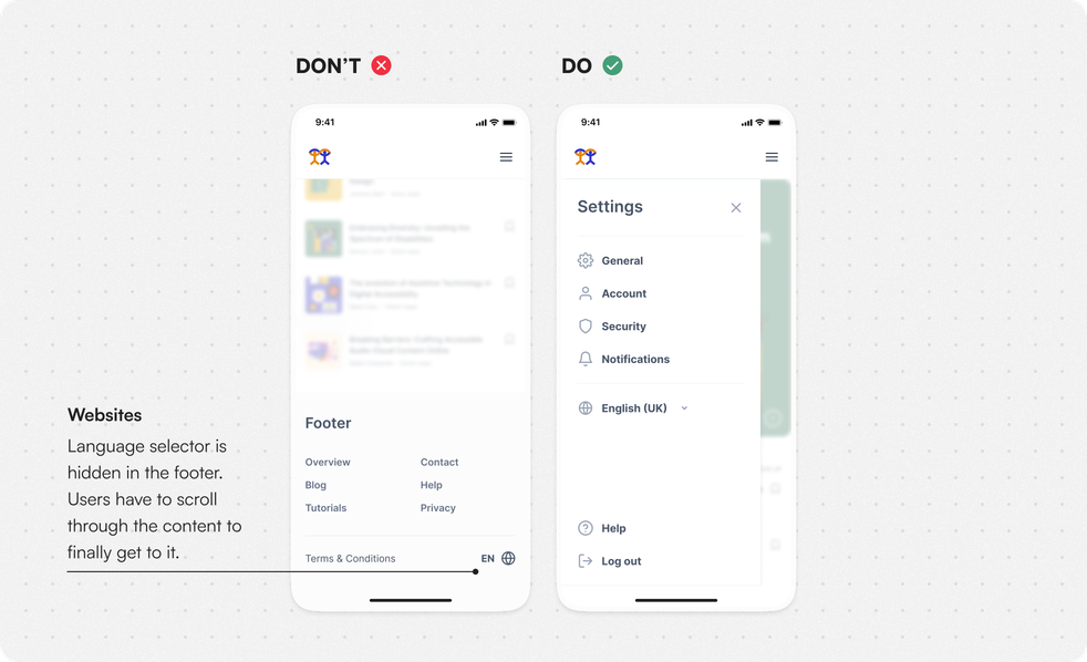
If the application supports multiple languages, ensure that the language selector is presented upfront.
Do:
- place language and country switchers in visible and prominent position.
Align with developer:
- always declare the language of the screen or site;
- see if it is possible to fetch language based on user’s device language. If not, then make sure language selection is visible upfront to avoid users getting lost (in translation).
Guidelines in WCAG
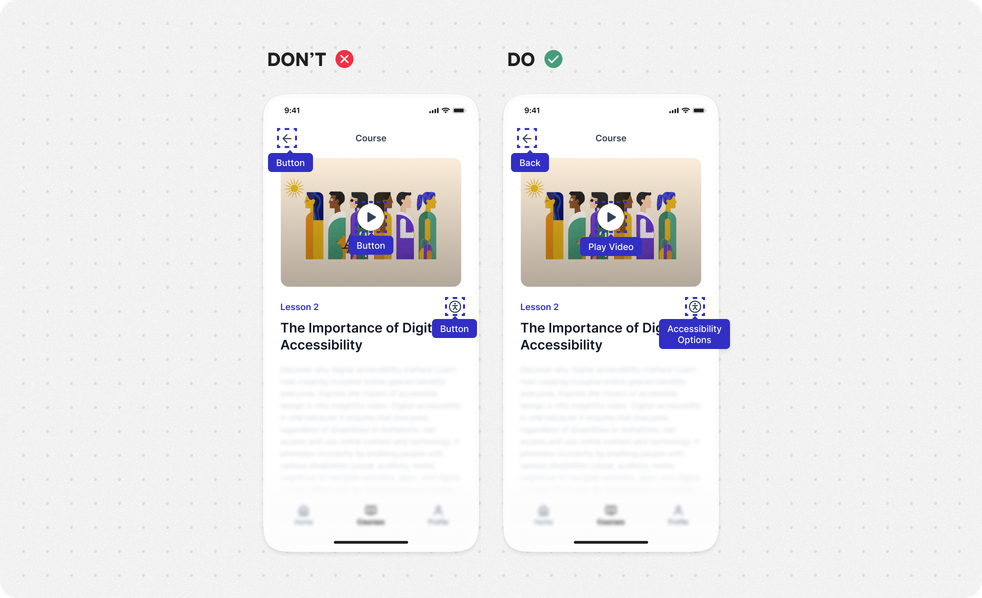
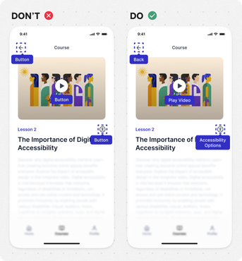
Include text alternatives
Non-text content need to be provided with brief description, so that it can be converted into other forms such as braille or speech.
Provide:
- names for your components that clearly describe their purpose.
Align with developer:
- create brief description for non-text content (excluding decorative elements), so that it can be converted into other forms such as braille or speech;
- provide alternative forms of CAPTCHA.
Guidelines in WCAG
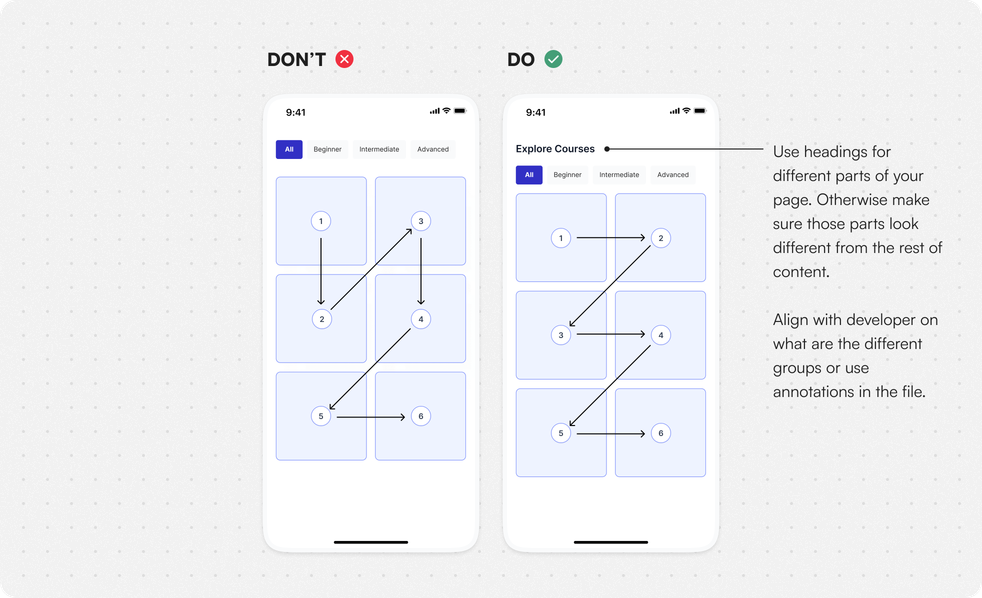
Keep a clear content structure
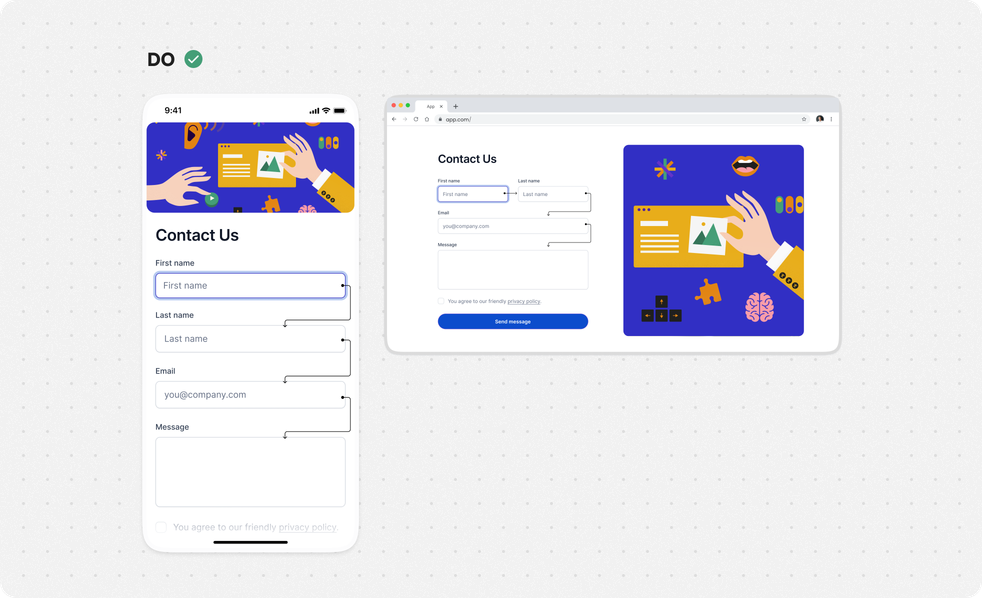
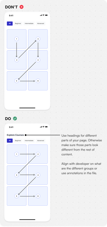
Users who rely on screen readers should be able to understand easily the order of content, different groups and sections on the screen and decide which sections to skip if necessary.
Do:
- create distinctive groups of items with their own headings;
- think about the order of the content on the page, that is going to be intuitive;
- set heading for each group of items or make sure they are visually different from the rest of the content;
- provide option to skip sections if necessary.
Align with developer:
- if the group doesn’t have a visual heading, discuss with developers what the different sections of your design are, or mark it in your design file; determine what should be the correct order of the items;
- provide option to skip sections for users using screen readers;
- align with devs on the correct order of how elements should be read.
Guidelines in WCAG
Useful Tools
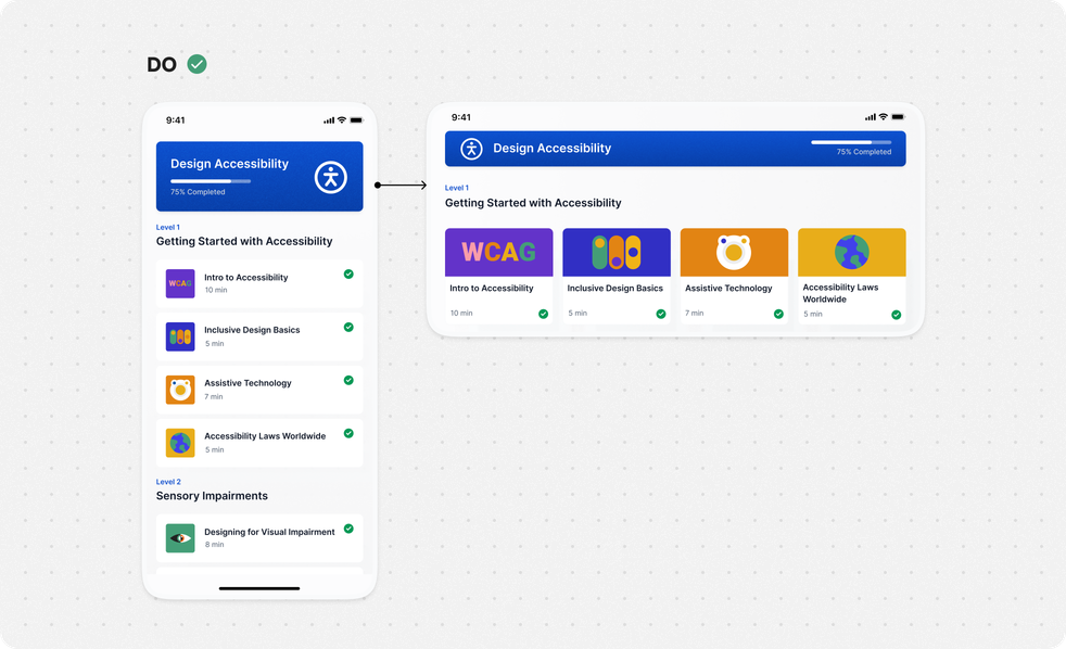
Use responsive layouts
Do:
make sure the layout can respond to different screen sizes. Elements need to adapt to the screen to the point of avoiding vertical and horizontal scrolling.
Don’t:
restrict the layout to portrait or landscape, unless the function needs to be performed.
Guidelines in WCAG
Interaction Design
Prevent errors
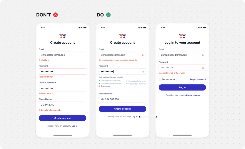
Prevent user errors by providing simple instructions or cues to help them understand what to do. The system should also check for errors in the data users input. If an error message appears, it should clearly show which element caused the error, both visually and audibly.
Do:
- use labels that clearly explain what each form field is for;
- provide option to confirm or cancel the submission;
- allow user to review forms and correct mistakes before submitting;
- if error occurs, indicate where and what type of error took place;
- exception: Indicating the source of an error could affect security.
Don’t:
- convey error messaging through color alone. Use additional prompts to give context of what went wrong.
Align with developer:
- use appropriate field format depending on the context;
- input fields that expect numerical values should trigger numeric keypad on mobile devices.
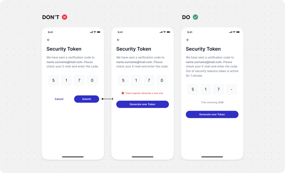
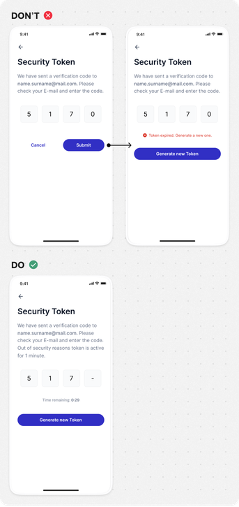
Extend time-dependent functionalities
Try to avoid content or actions that require time limits. It helps not only individuals who require more time to complete tasks, but also those who are multitasking or working in a distracting environment.
If a time limit is necessary ensure that:
- users can see the time remaining and have the option to extend it;
- controls to extend the time are accessible via keyboard.
Guidelines in WCAG
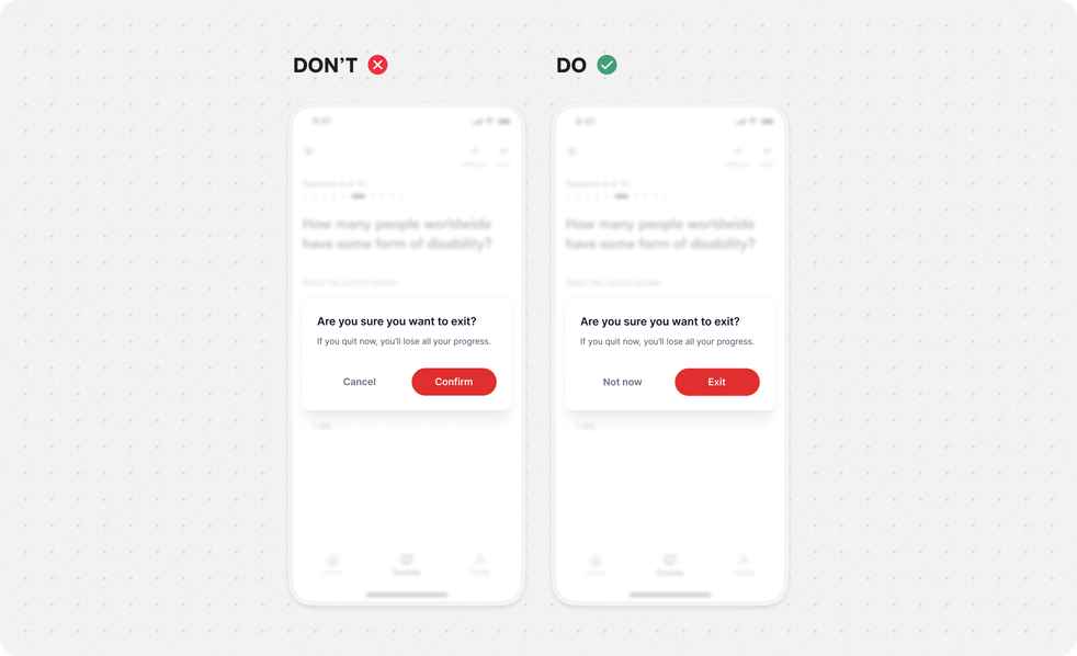
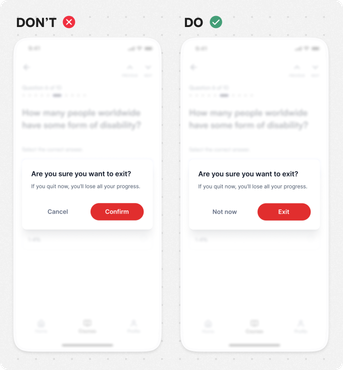
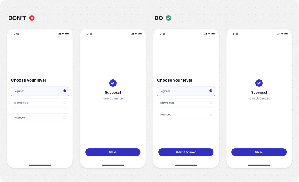
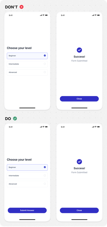
Do not change context without user confirmation
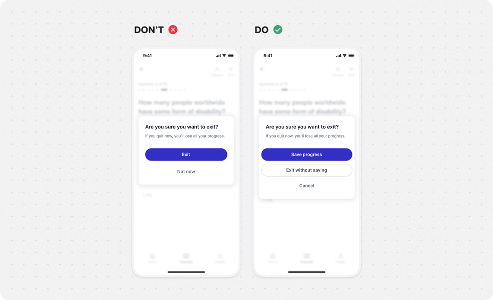
Context of the page/screen should be changed only upon user’s request or confirmation.
Avoid
- unexpected changes disrupting the thought process;
changes that don’t occur by user request include content that was not initiated by the user.
Provide:
clear question and an option user can choose from or confirmation action, before any context change.
Guidelines in WCAG
Use hover and focus best practices
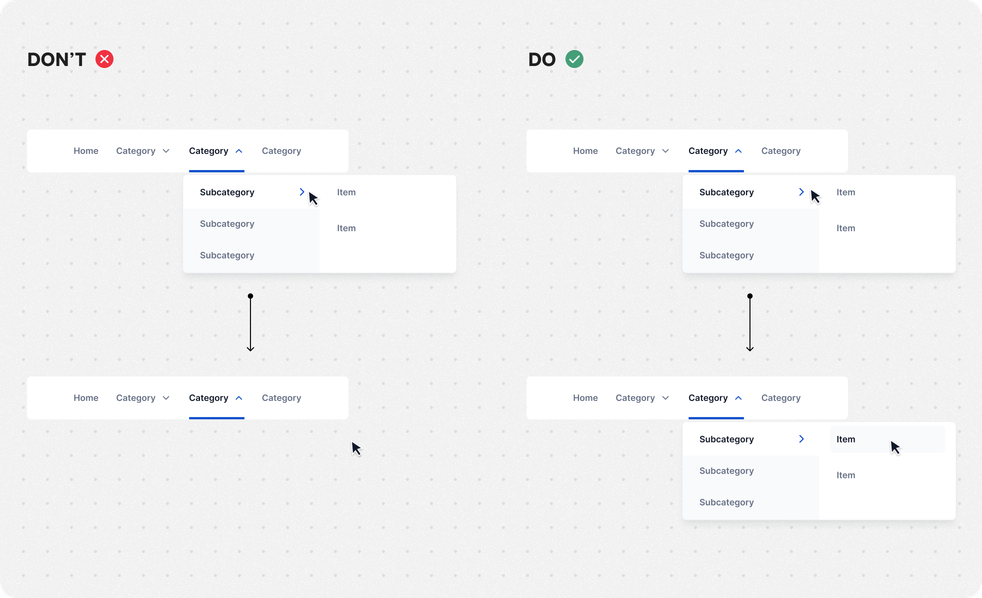
When using hover functionality make sure that user can access it or dismiss it properly.
Do:
- make sure that the new content remains visible, whether the hover is over the trigger element or the new content;
- close the additional content when the hover or focus trigger is removed, user dismisses it or its information is no longer valid.
Align with developer:
- provide a way to dismiss the new content (e.g. tooltip/dropdown) without moving pointer hover or keyboard focus. For example, use the “escape” key control to dismiss the content.
